Source link : https://las-vegas-news.com/7-book-covers-that-got-a-total-redesign-which-version-do-you-prefer/
Some books get a new cover every few years just to freshen up a shelf display. Others go through redesigns so dramatic that longtime readers barely recognize the title without checking the spine. The seven examples below all fall into that second category, cases where a publisher didn’t just tweak a font or swap a color, but rethought the entire visual identity of a beloved story. Some changes came from legal necessity, others from a milestone anniversary, and a few sparked genuine debate among readers about whether the update honored the original or lost something along the way.
1. Harry Potter and the Sorcerer’s Stone (and the whole series)
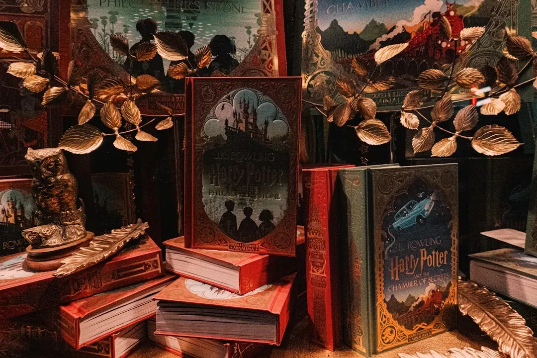
When Scholastic marked the twentieth anniversary of the American release of the first Harry Potter book, they didn’t just slap on a new sticker. Scholastic announced they had hired children’s book author and illustrator Brian Selznick to design the new jackets. Instead of the colorful, action-packed art fans grew up with, Selznick went for something quieter and more atmospheric.
He wanted the covers to be in black and white, and wanted to create a single image that told the story of all seven books. The real trick was pulling off seven covers that each worked on their own while also connecting into one continuous mural when lined up side by side. Selznick purposely created a greater image that connected each of the seven…
—-
Author : Matthias Binder
Publish date : 2026-08-18 06:56:00
Copyright for syndicated content belongs to the linked Source.
—-
1 – 2 – 3 – 4 – 5 – 6 – 7 – 8